
Bedroom Colour Schemes for Better Sleep
The colour of your bedroom walls does more than set a mood. It can genuinely influence how well you sleep, how relaxed you feel before bed, and how easily you wind down after a long day. For homeowners across Epsom and Surrey looking to update a bedroom, choosing the right colour scheme is one of the simplest and most cost-effective changes you can make. This guide looks at the science behind restful colours, the shades experts recommend, and practical tips for getting the finish right.
Why Colour Affects Sleep Quality
Colour psychology plays a real role in how our bodies and minds respond to a space. Certain colours are associated with calm and relaxation, while others are more stimulating and better suited to active spaces like kitchens or home offices. Bright, saturated colours can increase alertness, which is the opposite of what you want in a room designed for rest.
Light reflection also matters. Darker, more saturated colours absorb light and can make a small room feel cosy but closed in, while pale, muted tones reflect light and help a room feel calmer and more open. For a bedroom, the goal is usually a balance between a soothing atmosphere and a space that still feels warm and personal.
The Best Colours for a Restful Bedroom
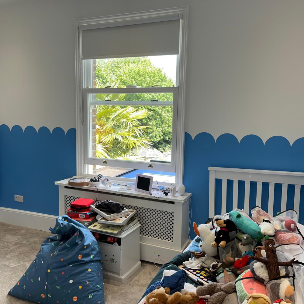
Soft blues. Blue is consistently rated by sleep researchers as one of the most calming colours for bedrooms. Pale or muted blues can help lower heart rate and blood pressure slightly, supporting the transition into sleep. Avoid overly bright or cold blues, which can feel clinical rather than cosy.
Warm neutrals. Soft greiges, warm whites, and gentle taupes create a calm backdrop that works well in most Epsom homes, particularly period properties where natural light can vary through the day. Neutrals also age well and are easier to accessorise around as trends change.
Muted greens. Sage and other soft, desaturated greens bring a sense of nature indoors, which has been linked to lower stress levels. Green works particularly well in bedrooms that overlook gardens or green space, tying the interior to the view outside.
Gentle lavender and dusty purple. Historically associated with relaxation, soft lavender tones can work well in bedrooms when kept muted rather than bright or saturated. This is a good option for anyone wanting something a little different from the usual blue or neutral palette.
Blush and soft pink. Understated, warm pinks can create a cosy, comforting feel without being overly bold, particularly when paired with warm white trim and soft lighting.
Colours to Approach with Caution
Bright reds, oranges, and bold yellows are generally best avoided on bedroom walls. These colours are naturally stimulating and can make it harder for the mind to settle before sleep. This does not mean they are off-limits entirely. A small accent wall or soft furnishings in these tones can bring warmth and personality without overwhelming the room, as long as the dominant colour scheme remains calm.
Very dark, high-contrast schemes can also work against a relaxing feel if not balanced carefully. Deep navy or charcoal can look striking, but pairing them with warm lighting, soft textiles, and enough natural light during the day helps prevent the room from feeling heavy or oppressive.
Choosing the Right Paint Finish
Finish matters as much as colour when it comes to creating the right atmosphere. A matt or soft matt finish is usually the best choice for bedroom walls, as it absorbs rather than reflects light, which suits a calmer environment. Glossier finishes tend to bounce light around the room, which can feel less restful, particularly with any overhead or ambient lighting left on in the evening.
For woodwork such as skirting boards, door frames, and window sills, a durable satinwood or soft sheen finish works well, giving a subtle contrast against matt walls without introducing harsh reflections.
Layering Colour with Lighting and Fabrics
Paint colour is only one part of a restful bedroom. Warm, dimmable lighting supports whatever colour scheme you choose, since cool white or overly bright lighting can undercut even the calmest wall colour. Soft furnishings such as curtains, bedding, and rugs in complementary tones help tie the whole room together and add texture without needing multiple paint colours.
A simple approach that works well in many Epsom homes is to keep walls in a single calm neutral or muted tone, then bring in colour and personality through cushions, throws, and artwork. This keeps the option open to refresh the room’s look in future without needing to repaint.
Getting Professional Advice on Colour Choice
Choosing a colour from a small paint chip can be misleading once it is on a full wall, especially with how light changes throughout the day in different rooms. A professional decorator can advise on how a colour will look under your bedroom’s natural and artificial light, and can test sample patches on the actual wall before committing to a full repaint. This is particularly useful in Epsom’s older properties, where smaller windows or north-facing rooms can change how a colour reads compared to a show home or paint swatch.
FAQs
What is the best colour for a bedroom to help you sleep?
Soft, muted blues are generally considered the most calming choice for bedrooms, though warm neutrals, sage greens, and dusty lavenders are also strong options for a restful atmosphere.
Should I avoid bright colours in the bedroom completely?
Not necessarily. Bright, stimulating colours like red or orange are best avoided as the dominant wall colour, but they can still be used sparingly through accents, soft furnishings, or a single feature wall.
Is matt or gloss paint better for bedrooms?
Matt or soft matt finishes are usually better for bedroom walls, as they absorb light rather than reflect it, supporting a calmer feel. Satinwood or soft sheen finishes work well for woodwork and trim.
Does a dark bedroom colour scheme affect sleep negatively?
Not necessarily. Dark colours such as navy or charcoal can work well when balanced with warm lighting, natural light during the day, and soft textiles, though they need thoughtful pairing to avoid feeling heavy.
How do I know if a colour will suit my bedroom’s lighting?
The best way is to test sample patches directly on the wall and view them at different times of day. A professional decorator can also advise based on the room’s natural light and aspect before you commit to a full repaint.
How often should I update my bedroom colour scheme?
There is no fixed rule, but many homeowners refresh bedroom decor every 5 to 7 years, or sooner if the room shows visible wear, or if lifestyle changes call for a different atmosphere.